The second “Win/Mac and X360 differences” post is about the aspect ratio and resolutions of the screen. This may not apply to all games as more and more casual games nowadays can be played on multiple resolutions included the X360 ones. However, I decided to write a post about it because that’s a problem I am facing at the moment.
Most PC/Mac casual games are only developed for a 4:3 resolution (640×480, 800×600 or 1024×768 generally). However, on X360, resolutions are mostly 16:9. In fact, the 1280×720 resolution is recommended by the XNA developers to ensure the game works on every video adapters. Spring Up’s resolution on computers is 800×600, and it will be 1280×720 on XNA, as shown on the first screenshot revealed last month.
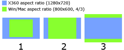
Of course, there is a difference in the number of pixels, but the biggest problem is the aspect ratio (from 4:3 to 16:9). The following picture illustrates the problem.
The blue sections represent the X360 screens and the green sections represent the PC screens. The first illustration shows how the 800×600 screen fits in the 1280×720 screen without any change of resolution. That’s the easiest way to do and what I did for the first screenshot of the game. Basically, you don’t change anything, you just render your game in the center of the X360 screen.
On the second illustration, the PC screen is enlarged so that it fits with the height of the X360 one. This is a 1.2 scale that transforms the PC screen in 960×720. You can see there are blue portions on the sides. That’s what Peggle did (see XBLA screenshot). They just added some (useless?) stuff on the sides to fill the gaps.
There is a third solution that scales the PC screen so that the left/right borders match with the 1280 width of X360. This is a 1.6 scale. In this case, some pixels are lost on the top and bottom if you keep the 4:3 aspect ratio.
I do not want to scale the objects of the game (balls, fans, launcher…) because I prefer pixel perfect sprites (one pixel of the texture is exactly one pixel on the screen). Consequently, in Spring Up!, I will probably move the items that compose the levels so that I take up more space on the screen. A good point to this solution is that it will contribute to correct one problem of the game stated earlier: objects will less likely be stuck due to extra spacing between targets.
I will also tweak the level design to “fill the blanks”, mostly on the left and right sides.
As the background is made up of tiles of 100×100 pixels, I just have to draw more tiles so that’s not a problem.
The walls will of course need to be moved to the sides of the screen.
Another detail that sometimes bother people that don’t think about it right from the beginning is the “title safe frame”. On X360, it is required that every important instruction on screen is displayed in the inner 80% of the screen. In 1280×720, that is 1024×576. On Win/Mac, I have many important information on the borders of the screen (bonus bar, score, level). I will need to change game design here to pass this requirement. I keep that in a corner of my head for the moment and will decide how to do it when working on the UI.
That’s it for resolution and aspect ratio, feel free to comment!
And happy new year! 😉
